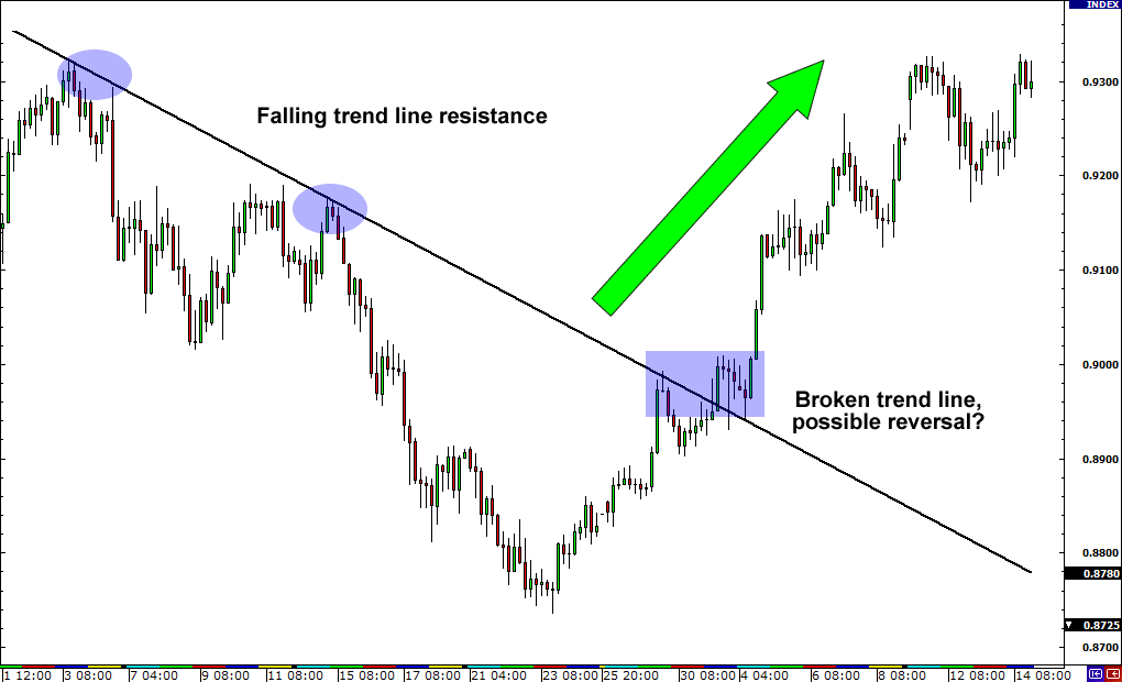
Candlestick charts are staple of stock market pros. They have been used widely since the 19th century when they were developed in Japan. Steve Nison is credited with bringing these charts to the West. Financial investors use from all walks of life use them to trade stocks, futures, commodities, currencies and so on. Read any financial newspaper or visit a financial website and you are likely to see candlestick charts put to use to display daily, weekly or monthly variation in price. Reading and understanding Candlestick charts takes some time, but with the proper training and understanding you can put them to good use to decipher complex patterns and make buy-sell decisions.
What are Candlestick Charts?
Investopedia explains that Candlestick charts are used to measure market emotions around stock or futures. They provide much more details compared to other charts such as line or bar chart. Similar to line charts, Candlestick charts provide the trend information over time, but they also go beyond that in showing the force behind those moves. They offer a perspective that other charts do not have the ability to provide.
As explained in this says TheStreet article “While a line chart gives you only one data point (normally the close price) for a stock at any point in time, candlesticks actually give you five: open, close, low, high and direction of movement. That’s a significant advantage when your trading decisions are based entirely on price action.”
Basics of Candlestick Chart
A candlestick chart shows a move or trend over time. To understand the chart you need to know the themes and the data points that make up those charts as explained below.
Data Points
Data Points
- High – Highest price for the day (or period of time charted)
- Open – Opening price
- Close – Closing price
- Low – Lowest price for the day (or period of time charted)
Themes
- Upper or lower shadow – Displayed when a high or low price swing falls outside of the opening or closing price
- Real body – The range between the opening and closing trades
- Color – Body is shown in white (or unfilled or green) if priced closed higher (increasing or bullish) or in black (or filled or red) if price closed lower (decreasing or bearish)
Candlestick Chart Patterns
The Candlestick chart by itself provides good information, but it is when you understand the complexity in those charts and recognize the patterns, you can really make good use of them to determine market trends and emotions and make important buy-sell decisions. Below I have explained those patterns from the basic ones to complex.
Basic Patterns
Big Black Candle: Defined by an unusually long black body with a wide range between the high and low closing prices. This is a bearish pattern.
Big White Candle: Defined by an unusually long white body with a wide range between the high and low closing prices. This is a bullish pattern.
Doji: A doji pattern forms when opening and closing prices are nearly the same, eliminating the appearance of a real body. It indicates that the market’s trend is losing momentum.
Dragonfly Doji: This doji pattern forms when equal opening and closing prices occur at the high of the day. It typically indicates indecision and a market trend nearing a major turning point.
Gravestone Doji: This doji pattern forms when equal opening and closing prices occur at the low of the day. Like the dragonfly doji, it typically indicates a market trend nearing a major turning point.
Long-Legged Doji: This doji pattern forms when opening and closing prices are equal, despite a lot of price movement throughout the trading period. It indicates indecision and can be significant during a strong uptrend or downtrend, where the long-legged doji suggests a shift in the direction of the market trend.
Marubozu: A marubozu is a candlestick with no shadows, which means that pricing stayed between the opening and closing prices. A marubozu is a continuation pattern. A white marubozu is bearish and a black marubozu is bullish.
Complex Patterns
Evening Star: The bearish evening star pattern is a reversal pattern that starts within an uptrend. The pattern starts with a large white candlestick and is followed by a small-bodied white or black candle that closes above the first white candle. The final candle is a large black candle that opens below the middle candle and closes near the center of the first candle’s body. This pattern predicts lower prices with a 72 percent accuracy rate.
Three Line Strike: The three line strike pattern is a reversal pattern that occurs within a downtrend and predicts a bearish recovery. It starts with three black candles that each post a lower low. The fourth candle opens even lower but reverses, creating a white bar that closes above the high of the first candle in the series. This pattern predicts higher prices with an 84 percent accuracy rate.
Three Black Crows: The bearish three black crows pattern is a reversal pattern that starts at or near the high of an uptrend. The pattern is defined by three consecutive black long-bodied candles that close lower than the previous day (or period), and each session’s open occurs within the body of the previous candle. This pattern predicts lower prices with a 78 percent accuracy rate.
Abandoned Baby: The abandoned baby candlestick pattern is a reversal pattern that can be bullish or bearish. It consists of three candles. In the bullish abandoned baby pattern, the first candle is a long bearish candle, the second candle is a small bearish candle or doji and the third candle is a long bullish candle. This pattern (bullish version) predicts higher prices with a 70 percent accuracy rate, according to Thomas Bulkowski in Encyclopedia of Candlestick Charts.

No comments:
Post a Comment